
Introduction
In the world of UX, we aim to create intuitive and error-free interactions for users. However, it’s also essential to acknowledge that users can make mistakes. That’s why it’s crucial to design fields and forms that can gracefully handle user errors. In this blog post, we’ll explore some practical strategies for designing form fields that not only prevent errors but also guide users through the process when mistakes occur.
While these strategies serve as a great starting point for designing error-friendly forms, it’s essential to emphasise that they should NEVER be applied without doing user research. What works as a general best practice may not necessarily apply to your site or brand, so rigorous user research (details in the second part of this article) must always be conducted to ensure an optimal user experience.
Best practices to help users avoid errors on user forms
- Choose the best input type for each field
- Place field labels close to their input field
- Use clear and jargon-free labels and instructions
- Clearly highlight mandatory fields
- Use auto-complete and suggestions to save time and prevent user errors
- Provide helpful constraints
- Provide just-in-time validation
- Use progress indicators and/or progressive disclosure in multi-step or complex forms
- Forgive typos and format errors
- Pre-populate fields where appropriate
Best practices to help users recover from errors on user forms
- Highlight the field of error with several indicators
- Display helpful error messages that help to recover
- Keep error message visible and close to the field of error
1. Choose the best input type for each field
Carefully consider what is the most relevant input type for each field by assessing the nature of the data that users need to input, and the expected or potential user interactions. For example, when it comes to entering a date of birth, separate number fields with full labels are more user friendly than date pickers (which may require a lot of clicking or tapping to find the right year and month) or drop down lists (which may require a long scroll to find your birth year). However, date pickers can be a relevant option when the date is closer, or if you need to choose a date based on the day of the week (e.g. booking a flight).


2. Place field labels close to their input field
Place field labels above their respective input fields to enhance user understanding and accessibility. The proximity between the label and the field enhances the visual association between labels and inputs, reducing cognitive load and streamlining the user’s ability to understand and complete the form quickly. Placing the label above the field is especially crucial on mobile to enable the field to span the entire width of the screen. If your page looks really cluttered and you’re thinking about replacing field labels with field placeholders, please don’t. It harms the user experience in various ways. Instead, start by considering whether some input fields could be removed. You may also explore alternatives like floating labels, although this option should be considered as a last resort as it still presents some accessibility challenges related to label readability. To enhance label accessibility overall, always ensure that the label exists in the code and that it is programmatically associated with the form field. Alternatively, use an ARIA label to ensure assistive technology can communicate what users are expected to enter into or select from the form field.


")
3. Use clear and jargon-free labels and instructions
Provide clear and concise labels that leave no room for ambiguity and are considerate of cultural differences. For example, spelling out the name of the month in a date picker instead of using numbers (e.g., 12 August 2023 or August 12, 2023 instead of 12/08/2023 or 08/12/2023) helps remove ambiguity if your users are located across different regions of the world.
For complex fields like passwords, provide a concise yet comprehensive set of clear instructions alongside the input, emphasising criteria such as minimum length or special character requirements.


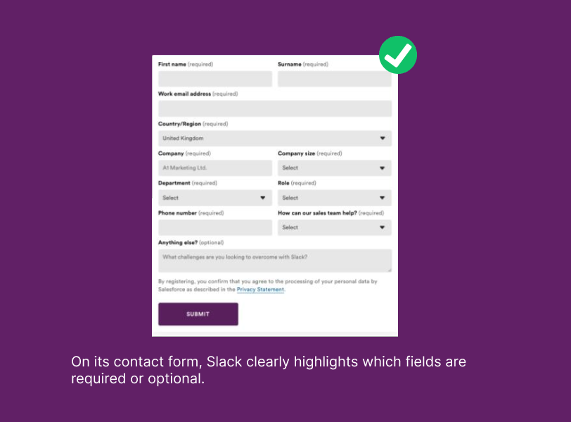
4. Clearly highlight mandatory fields
If a field in your form is not absolutely mandatory, your first instinct should be to consider removing it to keep the form as short as possible. If that is not an option, then it’s essential to provide users with a clear distinction between mandatory and optional fields. Common recommendations from industry leaders suggest using asterisks for mandatory fields or adding ‘(required)’ and ‘(optional)’ next to the field labels. From our experience testing forms across dozens of clients, there isn’t a universal solution: asterisks are not necessarily understood by users and may lack accessibility, while instructions like ‘required’ or ‘optional’ might clutter the page. We strongly advise to conduct some usability testing and/or moderated A/B testing to establish the most suitable approach for your specific form.
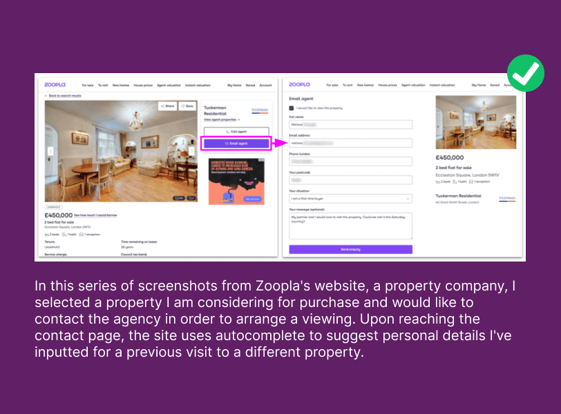
5. Use auto-complete and suggestions to save time and prevent user errors
Auto-complete can save time and reduce errors by suggesting or completing the entry based on the user’s previous inputs. For fields requiring complex data, such as dates or addresses, autocomplete can assist in ensuring accuracy and consistency.
6. Provide helpful constraints
Constraints are helpful when the type of input required needs to adhere to predefined rules or criteria. Some examples of useful constraints include:
- Matching field lengths to field sizes. In a payment for example, a credit card number is much longer than a postcode, so your postcode field should look a lot shorter than your credit card field. Ensuring the lengths of your input fields reflect the length of what users are expected to type will help guide them through the form.
- Using input masks when the format of the input is specific (e.g., phone number, credit card number etc). This helps prevent users from entering too much, too little or wrong data.
- Disabling non-applicable choices. In a hotel booking journey for example, you may want to prevent users from selecting dates in the past by disabling past dates in the date-range picker. In a form that requires users to input a date of birth, you may want to disable the choice of future dates to avoid errors as well.
- Matching the keyboard to the input type on mobile. For example, displaying numeric keyboards for number-only fields like credit card number, CVV or phone numbers reduces chances of errors due to users’ unconscious slips.


7. Provide just-in-time validation
To prevent common errors, use inline validation to provide instant feedback – after the user has moved to the next field – on whether their input is in the correct format. However, avoid premature inline validation (error message displayed as soon as the user starts typing); it distracts and confuses users.
For instance, right after the user has typed an email address, the field can display a green checkmark or a red “X” to indicate whether the input is valid (see example below). This way, users either receive positive feedback that contribute to building trust in your site, or they can catch errors as they happen and correct them immediately.
Real-time feedback is also beneficial for complex fields like passwords as it makes it easier for users to check that they’ve complied with all password requirements (see example below).


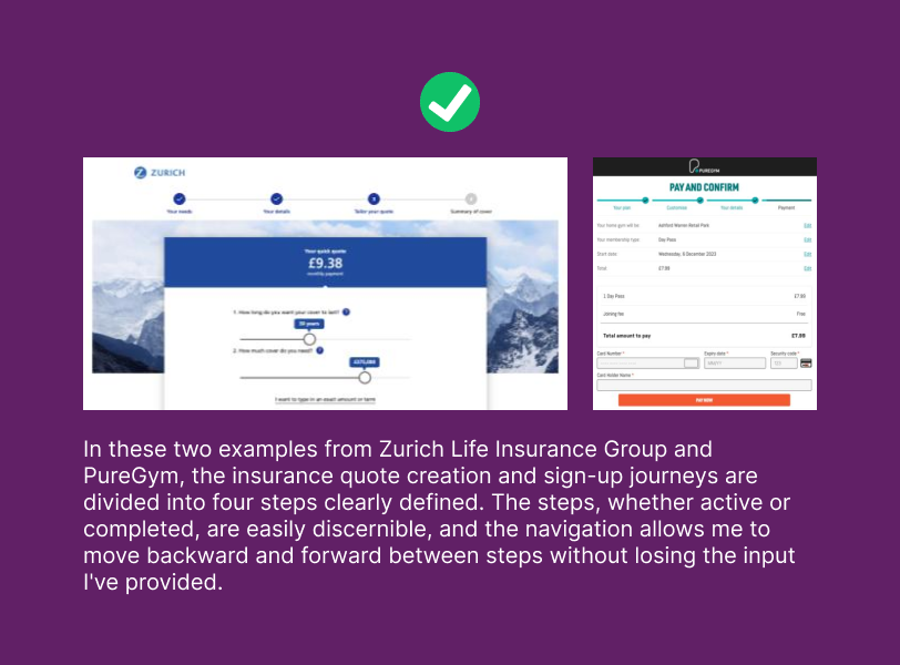
8. Use progress indicators and progressive disclosure in multi-step or complex forms
In cases where a lot of information, or complex information, is required, consider a progressive disclosure approach. Instead of presenting a long, intimidating form upfront, break it down into manageable steps or sections. This minimises the chances of users making errors due to information overload.
Then, use progress indicators to indicate which step is currently active and which ones are complete. Progress indicators typically include step numbers, labels, and some visual cues (such as check marks or highlighting). Also ensure that users can easily navigate back and forth between steps without losing their previous input.
9. Forgive typos and format errors
Use forgiving formats for fields where users are prone to make typos or use different variations in the way they input data (e.g., phone numbers, dates, credit card numbers, postal codes, currencies) to reduce user errors and accommodate the natural variations in how users enter data. For example, users can enter credit card numbers with or without spaces. A forgiving format would automatically normalise the format to match the required style (e.g., 1234 5678 9012 3456).
In the example above, Boots’ guest checkout uses input validation to enforce a standard format for credit card and expiry date fields. When entering the credit card and the expiry date numbers, the input automatically adjusts to match the credit card standard format.
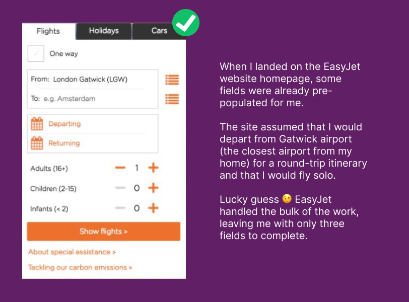
10. Pre-populate fields where appropriate
Where appropriate, pre-fill fields to reduce the chances of errors (e.g., suggesting the most common country or most used international dialling code as the default options). Your decision around which fields to pre-populate should be informed by the preferences or choices of the majority of users. Additionally, ensure that users have the flexibility to modify and reset the input in these fields.
11. Highlight the field of error with several indicators
Make it easy for users to identify the specific field where an error occurred by:
- Changing the problematic field’s border colour to red to visually highlight it.
- Using iconography (e.g., warning icon) to improve the discoverability of your error message.
Including a text error message, as icons and colours may not be enough for users of assistive technology.


12. Display helpful error messages that help to recover
When users do make errors, it’s crucial to provide meaningful and jargon-free error messages that clearly explain what has gone wrong and how to recover. So instead of generic messages like “Error” or “Invalid input,” clearly explain to the user how they can fix the issue. Ensure to test readability, accessibility and understanding of your error messages during usability testing.


13. Keep error message visible and close to the field of error
Keep error messages in close proximity to the field of error to allow users to address issues more efficiently. Ensure the error message remains visible while making corrections, eliminating the need to memorise the error details.
In this example above, the error message lacks clarity and appears far away from the field of error. Moreover, my email input has vanished, and it’s unclear what mistake I made, causing confusion about the nature of the error.
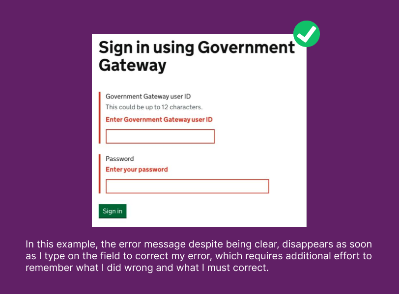
In this example above, the error message despite being clear, disappears as soon as I type on the field to correct my error, which requires additional effort to remember what I did wrong and what I must correct.
Want to some advice with your forms?
Bunnyfoot has always prioritised evidence capture and valid, bespoke study designs to truly understand the nature of user engagement, interactions and behaviours, in a holistic way.
If you would like to talk about how we can support you with gaining a deeper understanding of your audience so you can make evidence-driven design decisions, we’d love to talk! Contact us.

Related Posts