The attention economy
Human concentration is a fragile thing and I personally think smartphones and short-form media have eroded it completely, yet most, if not all digital content requires your attention to justify its existence.
The so-called ‘attention economy’… from ‘video on demand’ to shopping sites, the more you look, the more revenue you generate.
In other words, it’s in a service provider’s interest to attract and hold your attention.
Purveyors of digital crack like TikTok and Netflix have it pretty easy as we’re willing users and the interaction is 99% passively watching, but it’s often different for the web.
Web pages can be difficult or unappealing to engage with if their design is crowded, poorly organised, visually inaccessible or otherwise ill-considered, so naturally designers want to give their designs every chance of being loved. There are many ways to do this:
- Spacious, minimalist, aesthetic design
- Attractive, appropriate imagery
- Engaging copy and so on…
… but I’ve been increasingly noticing another tool at play and not in a good way.
Animation.
I spy, in the corner of my eye
Did you know that there are specialist cells in your eyes whose sole purpose is to direct your attention towards even the slightest movement in your visual field? A very sensible bit of biology to evolve when sabre-tooth tigers lurk in the long grass or someone is lobbing a rock at you.
Today we use them for sports, spotting wasps and gauging the relative queue speeds of different supermarket tills. They’re very, VERY good at what they do and triggering them steals attention so an assessment of relevance, opportunity and threat can be made.
A mechanism for stealing attention? In this economy? *rubs hands together*
In interactive and graphic design, this mechanism can be leveraged for a positive or negative user experience.
Types of animations
I suggest there are four types of animation to consider in interaction design:
- Indirect announcement
- Interaction effects
- Gratuitous animations
- Scroll triggered animations
Each has their place, strongly dictated by context.
Indirect announcement
Short and polite, designed to gently attract your attention. A waiter’s cough of an animation such as:
- Animating something being added to a shopping basket. This draws the user’s attention from the ‘add’ button to wherever the basket feedback is. The user is confident a product was added and knows where to look for their running basket total.
- Onboarding hints on page load. Subtle nods to new or important features.
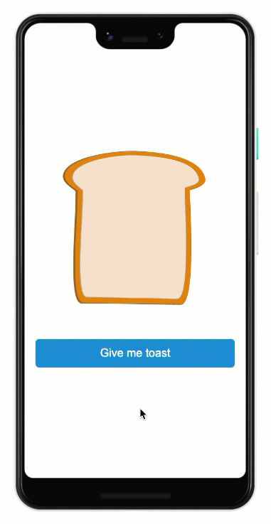
- ‘Toast’. A small information bar that ‘pops’ up from the bottom or top of the screen letting you know a setting has changed. A pause and it disappears again. Phone notifications are a solid example.
- Subtly animating in your cookie notification into a low importance part of the screen, announcing its presence but not distracting or preventing the user from undertaking their immediate task.
What all these animations have in common is they use those motion detection cells in your vision to briefly announce a feature, action or system state change BEYOND the user’s immediate point of attention. The user is notified of change but not overly distracted.
Interaction effects
This is bling, but attached directly to a user interaction, so the user’s eyes are already there. It can assist in helping users understand what is interactive, how something works and can contribute to an overall sense of intuitive and effective user experience:
- Animating the slides in a carousel when you click < or >
- Interaction styles such as button click or mouseover.
- Fuze buttons – pressing and holding a button shows the button filling, denoting the time it takes until the click is registered.
- Menus sliding into the page when you click the burger button.
- Clicking play on a video. When buffering, an animated spinner spins merrily, letting you know the system is hard at work.


While buttons, carousels and such don’t always NEED animated styles, they may be enhanced by them. If those animations are incongruous however, they may detract from the user experience. Less is more here.
Gratuitous animations
Any animated element on a page that is specifically designed to pull focus with little or no consideration of the user’s motivation for being there.
The obvious example here is advertising. Often site owners sell the space on a page but have little control over the ads that are served. This can decimate user experience as unscrupulous advertisers design ads that capitalise on our motion detection systems to draw attention to themselves. 
Of course, advertising is critical for the funding of many services but we should try and retain any control that’s possible:
- Can you dictate the look and feel?
- Can you specify no animation?
- Can they be partitioned off into their own dedicated section rather than being in-lined with other content?
Auto-play carousels are perhaps a less obvious example. Usually placed as a hero at the top of a page they’re used as a mechanism to promote several different bits of content into the expensive real estate. Load the page and away they go… slide 1… slide 2… slide 3… slide 1 and so on.
Many of our user testing sessions have shown them to be distracting and jarring, particularly when the transition speed and animation is too fast. Of course they can be designed sensitively with slower transition speeds, pause on mouse-over behaviours and manual controls. Importantly they can be scrolled past… out of sight, out of mind. Not so bad.
But be wary of gratuitous animations as they can make pages unlikable and/or unusable.
Scroll triggered animations
This is what I’ve been noticing more and more of recently. Specifically, whole sections of a page being animated as the page is scrolled:

- Images expand and contract, they fade in and out.
- Some elements fix to the screen as the rest of the parent section scrolls behind, only to unfix and scroll away as the parent section ends.
- Parallax effects see sections entering and leaving the viewport at speeds that don’t match the user’s scrolling.
- Copywriting appears and disappears as its section takes centre stage.
Modern browser standards, powerful consumer devices and off the shelf web templates make such animations ubiquitously available. Applied well, the user experiences a dynamic, living page full of movement and this often works well for pages where the content IS primarily aesthetic and the medium supports the message; portfolios, galleries, webcomics and so on.
But…
Context is everything
While I think that well-designed animations supporting indirect announcements and interaction styles can (and should) be applied confidently to ANY page, scroll-triggered animations are often NOT appropriate, particularly for task-oriented websites where users need to concentrate.
If your page is designed to deliver lots of detailed information in the form of text, tables and data visualisation etc, what would such animations contribute?
I would argue that scroll-triggered animations can actively detract from the user experience in a few key ways:
- Dynamic movement can prevent the user from establishing a mental model of the page’s layout. It’s hard to build a house on quicksand.
- Unpredictable navigation may be counterintuitive, making it difficult for the user to orientate themselves.
- Does it pass my patented ‘Father in law’ test? Non-digital natives (older folk) are still struggling with mouse wheels and tabbed content… the sheer novelty of scroll-triggered animations could be disorientating and disconcerting.
- They tend to be VERY space inefficient, requiring one viewport (the visible screen) per animated section. This means less content in a single viewport and lots and lots of scrolling to get to other content.
- Is it accessible? Fancy-looking things are sometimes (not always) difficult to make accessible.
- Finally, referring back to our eye’s motion detection system, if everything is moving, the user is going to find it very, VERY hard to concentrate on the content they want and you need to hold their attention.
Gratuitous animations are almost never a good idea as they actively distract the user and sour their experience.
Recommendations, not conclusions
For the VAST majority of our clients, their job is to deliver information to their myriad users and have a responsibility and desire to make sure that information is as easy to access and digest as possible.
Animations can help users, even the less technologically savvy, by giving them timely feedback and directing attention to important changes. They can contribute to a general sense of design sophistication, maturity and fun.
If you’re not delivering high-concept, high-aesthetic content, carefully consider how the audience will experience the animations being used. Anything that needlessly attracts attention or does not support the user’s task at hand will be at best distracting for some and… at worst unusable for many.
But if you’re delivering beautiful content to smart, tech-savvy folk… go for it, but everyone should avoid being gratuitous.
So what next?
As discussed, it’s not straightforward to know when and where animations should exist. Understanding your users and the context they are in when on your digital service is key. Interested in understanding your customers better? We can help – get in touch, we’d love to talk.

Related Posts