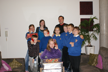
This week, we’ve been overrun with 10-11 year olds from Royal Mile and Long Niddrie Mill primary schools, showing us up with their amazing ideas for how to improve communication in their schools for World Usability Day.
We’re hoping to teach them that usability is a key element when designing tools for communication by helping them to test their products in a professional environment. Each team appointed a moderator, then watched from the viewing room as a group tested their prototypes.
Royal Mile Primary School
The need: Kids see technology as a great way to research, communicate and submit their work all in one device. There’s still the importance of handwriting, drawing and spelling, which existing technology doesn’t seem to address, but they have a solution…
Group 1 – Smart Touch II
The design: After considering 2 initial designs, the Smart Touch II was favoured by the team. It has an internet function to allow them to research, communicate with the teacher or submit work. The cunning bit comes from the in-built scanner which allows them to submit handwritten work and drawings. They added a headset and microphone for further interaction, but removed the spellchecker function to reinforce spelling and grammar.
The results: The kids loved to see their idea being embraced by the group, but realised to make sure all the features are appreciated they needed the options to be more intuitive. They are going to go back to use the feedback on their labelling to see if they can make it clearer.
Group 2 – Aye i desk
The design: This touch-screen desk changes like a chameleon for the task at hand to give kids an interactive experience to learning. Controlled by the teacher – children can access the internet, listen to music, use software and complete homework, yet with no spell check, so no cheating! Each child has a secure login for a personalised system.
The keyboard can be hidden away and the touch screen flipped over to increase workspace, depending on the task. A headset allows the kids to communicate with teachers and each other, no matter which classroom they are in.
The result: A difficult one to introduce, with the innovative design and great level of flexibility of use. The ways it could be manipulated were clear, but navigating the functions was a bit harder. They realise they don’t want to have to rely on the teacher to explain how it all works, so they are going to look at how they can improve their navigation and labelling for their next test.
Niddrie Mill Primary
The need: Kids want to be involved in their meal choices at school. They want to eat healthily, but they also want to enjoy their food and make the most of lunchtimes.
Group 1 – Food ordering system
The design: The Food Ordering System lets the kids choose their lunch menus from their table, sending the orders to the kitchen, which could then be delivered. After dinner the children can give feedback on their lunch, simply pressing a button to “vote” yes or no. To save space, the central button is on a “hinge” design to allow it to be used to both order food and vote. Wisely, they added a cancel button in case you make the wrong choice.
The result: It was a well implemented design, but it was clear that in trying to keep the design simple, the team had actually complicated matters! The group favoured 2 separate buttons and didn’t understand the “yes/no” option to give feedback. The team have a bit of research ahead of them to find some better terms for feedback.
Group 2 – Food feedback system
The design: Full marks to this team for keeping accessibility in mind with their design! The handheld device allows kids to give feedback on whether or not they liked their lunch through voice or touch activation. Receivers in the kitchen counted the votes so unpopular meals could be scrapped.
The result: Great idea, but the ergonomics of the headset were found to be the main issue. With notes on the design and feedback on their labels, the team are in a great position to make some updates to make it truly fantastic.
Overall
We are really proud of the kids and what they have achieved here. All teams understood the process of user feedback, UCD and focus groups as they all learned something about their designs that they hadn’t previously thought about. It’s great to see them excited and inspired this way, they’re all buzzing with ideas for all the changes they can make. We are looking forward to their final presentations.
Inspired you to make your designs more user focussed?
User Centred Design was much easier for the kids as they are surrounded by their target audience for inspiration and feedback. Many of our clients simulate this experience using personas, sticking up posters of their target audience based on our research to base decisions on.
It’s easier to make changes from a prototype – and the best way to know how is through user testing. We can help you find the people, moderate the tests and give you some solid actionable results to help you make the best final design for your market.
The final team were the only ones to implicitly think about accessibility. It’s easy to forget about people using different platforms or means to access technology, but it can also be very easy to include everyone without affecting your design. Ask us how.

Related Posts