So, you’re designing for VR and don’t know where to start? As with anything, the best place to start is by thinking about your customers and how and why they would interact with your service.
Designing for VR is very different to 2D and poses a whole raft of possibilities and considerations. What is interesting is that VR stimulates all the human senses, as there is not only a cognitive impact on the user but also physiological.
Understanding the human body and mind will be more important than it ever has been when designing for digital. Getting immersion right and ultimately the user experience is vital for the success of a VR application. A poor experience will not only result in users turning off, it will be uncomfortable and unpleasant. The following are both design and immersion principles that anyone designing for VR should be aware of.
UI design principles
Menus
The VR experience is one of a 360 world so utilise this and build accordingly:
- 2D UI elements such as menus sit awkwardly in the 3D landscape and become difficult to read or interact with when in the user’s periphery
- Design menus so they fit the 3D landscape
- Avoid placing menu items behind the user’s view as they have to work hard to find them
- There is no fixed type of menu that you have to use, it really depends on how your content is structured and it’s scalability
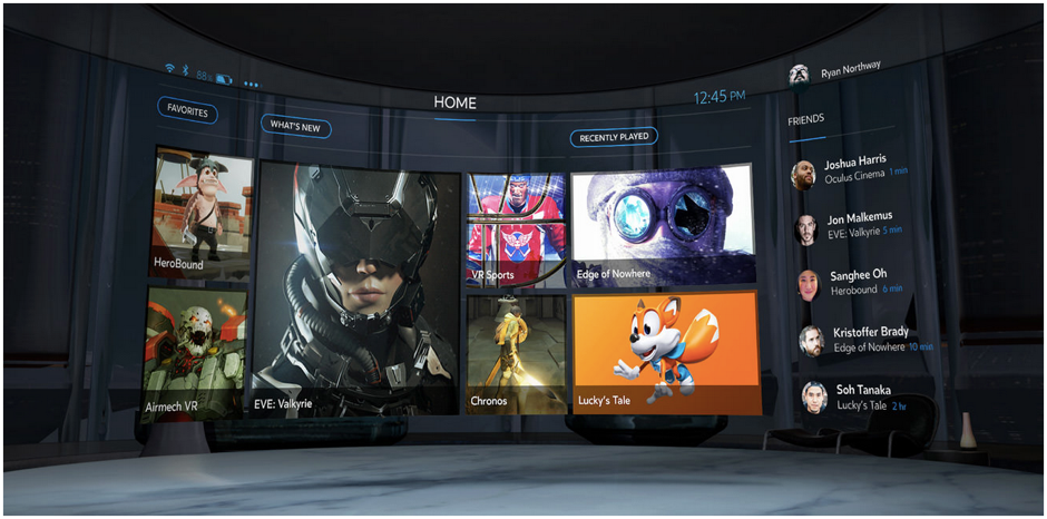
- The most common menu pattern out there is the 2D ‘flat’ menu. A good example of this is the Oculus Rift’s home menu:
Interacting with stuff
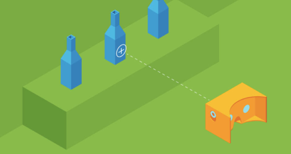
It’s important for users to know what they are looking at and how to select it. Very common on cheaper headsets or those without controls is the use of reticle and fuse widgets – what on earth are these? Let me explain. A reticle, or crosshair as we like to call it, provides the user with a reference point as to where they are focusing their attention, this is very important when it comes to interacting with objects and executing actions.
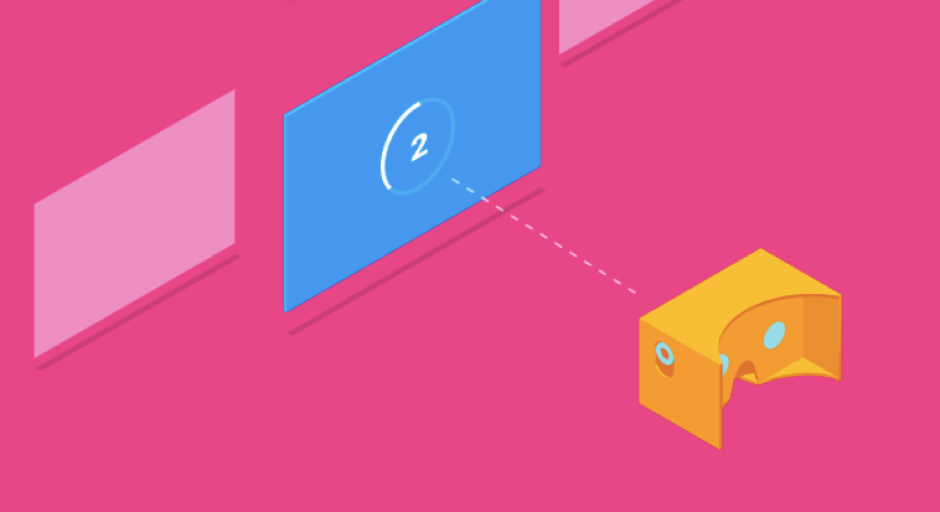
A fuse widget provides the user with a countdown when they are focusing on an interactive object, most often a button to select. This provides enough thinking time to reduce the risk of accidental selects. In general, it’s important to avoid placing fuse buttons or interactive objects in close proximity to each other.
Getting home
The virtual environment can be a rather intense experience, not only because of the immersive experience going on inside the headset but also the physical act of wearing a chunk of gear on your face. It’s therefore important to provide an easy way for the user to pause their session and take a break. That said, we don’t want to keep interrupting the experience, as a bare minimum we should provide an easy way to pause and consider prompts like those seen on the Nintendo Wii encouraging players to take some time out.
Anchor and ground
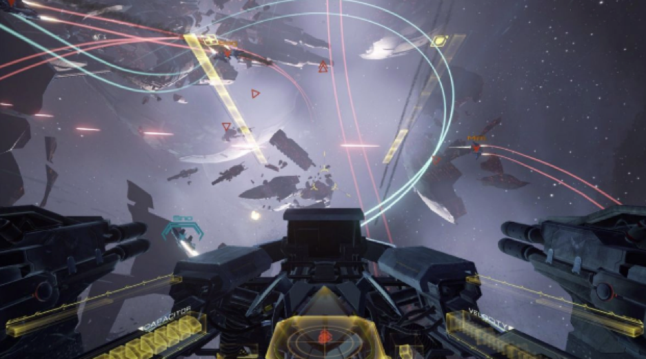
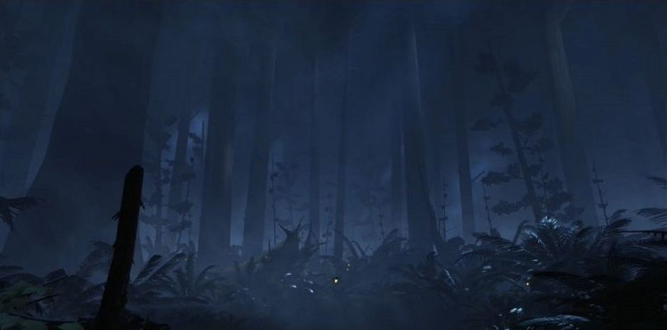
Motion sickness or ‘Cyber sickness’ is a real problem with VR. There are ways we can design to reduce the risk of making a mess on mum’s living room carpet. One effective way is to provide a fixed point so that the user can orientate themselves and have a fixed point of reference. This is often something in the foreground, for example cockpit controls in a flight sim game. Another big cause of Cyber Sickness is when your environment has a rolling horizon; to avoid this keep it steady so it doesn’t feel like you’re on a ship at sea.
Immersion principles
Head tracking
Probably the most important guideline to adhere to when avoiding cyber sickness and achieving positive immersion is for head tracking to be constant. This means as the user’s head moves from side to side and up and down, this movement is reflected in the app, with as little delay as possible. Likewise, the user’s view should never be forced against their natural head movement. If this principle is not met then it’s sure to upset the wearer of the headset and disorientate them.
Locomotion
The general rule of thumb here is that the user is always in control, that is, when movement is necessary don’t force it on them and catch them out. It is the user who should decide when they are ready to move, the last thing a user wants while immersed in VR is the feeling they are out of control. There are exceptions to the rule of course such as a rollercoaster ride, but even then, there should be an element of control e.g. starting, pausing, stopping.
Acceleration and Velocity
During VR immersion the user does not feel the speed or direction they are moving, nor do they feel acceleration or deceleration as they would if they were sitting in a car driving around town. If the experience is trying to simulate these forces then the effects can be rather unsettling for the user. If movement is necessary then use acceleration and deceleration subtly so as to provide a smooth ride for the user.
Attracting attention
It’s been applied in the gaming industry for a long time, but the subtle use of light and movement to attract a user’s gaze to guide them will be more important in the 360, virtual world. Without these visual (and audio) cues then it’s very difficult in a 3D landscape to attract a user’s attention where it’s likely the VR environment presents many distractions.
The soundscape
Spatial audio or Holophonic sound basically means 3D audio. Considering that the aim here is to transport the user to a convincing, other worldly environment then audio should be used to heighten the sense of immersion and also act as cues to what the user can interact with. For example, the sound of a jet flying overhead might prompt the user to look up where they discover a message in the sky.
Keep users in mind when designing for VR
As VR continues its upward trajectory and more of us experiment with what’s possible, what works and what doesn’t – these short guidelines will evolve and shape what we will recognise as good VR design in years to come. Like all good design guidelines, they centre around the user and their needs. Just like more established platforms, extensive testing with real people will be paramount if VR is to fulfill its potential and reach new heights.
Thinking about starting a VR design project? Get in touch, we’d love to have a chat and see where we can help you out.
Find out more:
- The reality of virtual reality testing: our top tips
- Course: UX Strategy
- Course: Customer research methods & practice

Related Posts